Based on the research that i have done Art Nouvea sprang from the Arts and Crafts movement. Just like the Arts and Crafts movement was a reaction against the Industrial Revolution, Art Nouveau was a reaction against Victorian era rigidity. Based on research Art Nouveau Movement was highly influenced by the Japanese art. One of the most popular Japanese wood block prints is called Ukiyo-e. One can also notice these Japanese motifs on the work of Mackantosh and the Glasgow school. Art Nouveau posters are usually heavily outline with black and filled with flat colours. The subject of the posters was normally an image of a women and the illustrations were so simple that almost all the details were removed also notice that the womans hair was always abstract
Art Nouveau was an international decorative style that flourished in Europe during the 1890 and went on for about two decades. The term Art Nouveau came to life in a Paris gallery that was run by an art dealer Samual Bing which opened in 1895 as the Salon de l’Art Nouveau. It included all design arts, architecture, furniture, product design, fashion, graphics, posters, advertisements packaging etc….
Art Nouveau was an international decorative style that flourished in Europe during the 1890 and went on for about two decades. The term Art Nouveau came to life in a Paris gallery that was run by an art dealer Samual Bing which opened in 1895 as the Salon de l’Art Nouveau. It included all design arts, architecture, furniture, product design, fashion, graphics, posters, advertisements packaging etc….
The Art Nouveau movement had an intense interest in the
organic whose physical aspects were derived from nature and the female figure
and expresses as plant like forms such as Tendrils, sinuous of whiplash curves,
lavish and undulating shapes. It was mostly derived from the Gothic and Rococo and from
the arts of Japan. The movement was also inspired by the Celtic art, Persian, Classic art, Egyptian and Greek.
Philip B. meggs. and Alston W. Purvis.eds., 2012. Meggs’ History of Graphic Design. Fifth Edition. Hoboken Canada: John Wiley & Sons,Inc pg 200
Art Nouveau as in:
Philip B. meggs. and Alston W. Purvis.eds., 2012. Meggs’ History of Graphic Design. Fifth Edition. Hoboken Canada: John Wiley & Sons,Inc pg 200
Art Nouveau as in:
- France
- England
- Belgium
- Germany known as Jugendstile
- America


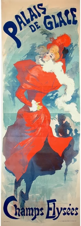
The above images show
- flat colours
- bold out lines
- 2 dimensional
Art Nouveau Influences:
- Nature
- Human Figure
- Rococo
- Gothic Revival
- Japanese Art
- Celtic Art
- Egyptian Art
In Art Nouveau graphics, the organic liner movement often control
the spatial area and over the visual properties, such as colour and texture. In
Art Noveau the basic forms and shapes were formed, and changed with the design of
the ornaments. T

The illustrators and graphic designers of Art Nouveau tried
to make art as part of their everyday life. Their training of fine arts
educated them about the forms of art and methods and developed primarily and
aesthetic considerations
Important Art Nouveau Designers
- Jules Cheret
- Eugene Grasset
- Aubrey Beardsley
- Henri de Toulouse-Lautrec
- Alphonse Mucha
Jules Cheret & Eugene Grasset
The two leading graphic designer of Art Nouveau were Jules
Cheret and Eugene Grasset. They both played an important role in the
transition.
In 1881 the French law allowed posters anywhere except on
churches this new law lead to a blooming poster industry hiring designers and
printers. All the streets of France became an art gallery for the nation.
Jules Cheret is now known to be that father of posters and the
father of modern lithography. Cheret printed his first poster in colour in
France than advertising was introduced to the world of colour. Cheret was convinced that pictorial lithography poster would
replace typographic latter press posters that filled the urban environment, but
he could not convince the advertisers of this.
Philip B. meggs. and Alston W. Purvis.eds., 2012. Meggs’ History of Graphic Design. Fifth Edition. Hoboken Canada: John Wiley & Sons,Inc pg 201

Jules Cheret, poster for Orpheus Hades 1879
- Bold outlines
- Bold lettering
- Animated figures
- Greater unity of word and image
- Flat colours
During the 1870’s Cheret evolved away from the Victorian
complexity, he began to simplify his designs and increasing the scale of his
major figures and lettering.
Philip B. meggs. and Alston W. Purvis.eds., 2012. Meggs’ History of Graphic Design. Fifth Edition. Hoboken Canada: John Wiley & Sons,Inc pg 202
Philip B. meggs. and Alston W. Purvis.eds., 2012. Meggs’ History of Graphic Design. Fifth Edition. Hoboken Canada: John Wiley & Sons,Inc pg 202
The following list is what was used in Cheret's work
- stipple and crosshatch
- soft watercolour like washes
- bold calligraphic chunks of colour
- scratching
- scraping
- splattering

Eugene Grasset
Eugene Grasset was a Swiss born illustrator and designer who
was first to expose Charet to the public. Grasset had studied deeply the medieval
art, and his influences had mingled with love of exotic Asian art, which were
reflected strongly in his designs for furniture, stained glass, textiles and
books, Grasset did something other than
posters, which was the only thing that Cheret was popular for. A monumental achievement for Grasset was his
1883 publication of The Tale Of The Four Young Men Of Aymon, which was designed
and illustrated by Grasset himself it was printed in an aquatint-grain/
color-photo relief process from plates made by Charles Gillot. Gillot was
responsible for transforming Grasset’s line and watercolor designs into subtle,
full color printed book illustrations. It was one of Grasset’s working
philosophies that design was important for its total integrations, format and
typography. Spatial segmentation was used as an expressive component in the
page layouts. This is evident in Grasset’s work. In 1886, Grasset received his
first poster commission. His willowy maidens, who wore long, flowing robes and
struck static poses to advertise inks, chocolates, and beer, soon began to
grace French streets.

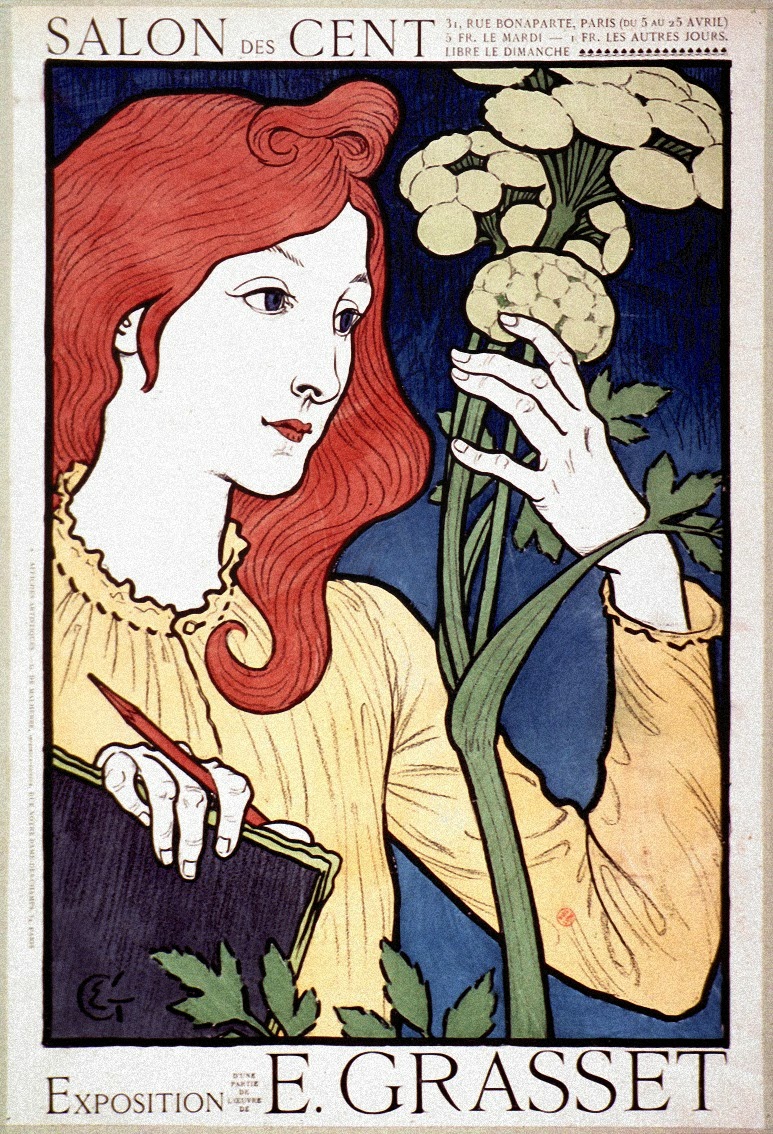
For the above poster Grasset used a thick black contour drawing locking forms into
flat areas of colour in a manner similar to medieval stained-glass windows. His
figures echo Botticelli and wear medieval clothing and his stylized, flat cloud
patterns reflected his knowledge of Japanese woodblocks. Grasset’s formal
composition and muted color contrasted strongly with Cheret’s informally
composed brightly coloured work. In spite of Grasset’s tradition-bound
attitude; his flowing line, subjective colour, and ever-present floral motifs
pointed toward French art Nouveau. His works included wallpaper and fabric
design, stained-glass windows, typefaces and printers ornaments.
Philip B. meggs. and Alston W. Purvis.eds., 2012. Meggs’ History of Graphic Design. Fifth Edition. Hoboken Canada: John Wiley & Sons,Inc pg 205
Philip B. meggs. and Alston W. Purvis.eds., 2012. Meggs’ History of Graphic Design. Fifth Edition. Hoboken Canada: John Wiley & Sons,Inc pg 205
Philip B. meggs. and Alston W. Purvis.eds., 2012. Meggs’ History of Graphic Design. Fifth Edition. Hoboken Canada: John Wiley & Sons,Inc pg 205
Art Nouveau in England
Art Nouveau in England was mainly focused on graphic design and illustrations rather then furniture and product design. The main source of inspiration of Art nouveau in England was of the Gothic art and the Victorian painting. During the month of April 1983 a magazine called “The Studio” was issued. This magazine was an illustrated fine arts and decorative arts magazine which had reproduced the work of Aubrey Beardsly, it also included work by the Dutch artist Jan Toorop “The Three Brides” and the work of Walter CranePhilip B. meggs. and Alston W. Purvis.eds., 2012. Meggs’ History of Graphic Design. Fifth Edition. Hoboken Canada: John Wiley & Sons,Inc pg 205

Aubrey Beardsly, First Cover for "The Studio"

The above image is called “The Three Brides” by Jan Toorop 1893. The illustration is done in pencil and coloured crayons, drawn on brown paper. The undulating flow of stylized ribbons of hair symbolizes pouring forth from the bells. Toorop's curviliner drawing inspired his contemporaries
Philip B. meggs. and Alston W. Purvis.eds., 2012. Meggs’ History of Graphic Design. Fifth Edition. Hoboken Canada: John Wiley & Sons,Inc pg 206
Philip B. meggs. and Alston W. Purvis.eds., 2012. Meggs’ History of Graphic Design. Fifth Edition. Hoboken Canada: John Wiley & Sons,Inc pg 207

The above image is an illustration by Beardsley on a double page spread for Marlory’s Morte d’ Arthur, the image shows:
- Compose counter outline
- Textured areas
- Black and white shapes into powerful composition
- Contrast between geometrical and organic shapes
- Influence of the Japanese print
Philip B. meggs. and Alston W. Purvis.eds., 2012. Meggs’ History of Graphic Design. Fifth Edition. Hoboken Canada: John Wiley & Sons,Inc pg 206
The above image is a page from The Recuyell of the Hoistoryes of Troye 1986. The comparison of the page as designed by William Morris. By visualizing the design ideas of the Kamscott Beardsley replaced the formal, naturalistic borders whit more stylized flat patterns
Philip B. meggs. and Alston W. Purvis.eds., 2012. Meggs’ History of Graphic Design. Fifth Edition. Hoboken Canada: John Wiley & Sons,Inc pg 208
Philip B. meggs. and Alston W. Purvis.eds., 2012. Meggs’ History of Graphic Design. Fifth Edition. Hoboken Canada: John Wiley & Sons,Inc pg 208
Aubrey Beardsley was the art editor and designed the front cover of the yellow book, which was first published in 1894. The Yellow Book was a progressive journal of the arts.


Toulouse-Lautrec was a French painter, print maker, draughtsman and illustrator. Lautrec often exhibited scenes from brothels and cabaret clubs, including the Moulin Rouge, where he had a seat reserved after producing a series of promotional posters for the club’s opening in 1888. Lautrec was influenced by the artists Edgar Degas and Edouard Manet, who shared with them a keen interest in the observation of social culture.
Philip B. meggs. and Alston W. Purvis.eds., 2012. Meggs’ History of Graphic Design. Fifth Edition. Hoboken Canada: John Wiley & Sons,Inc pg 209

2014. . [ONLINE] Available at: https://www.tate.org.uk/art/artworks/beardsley-cover-design-for-the-yellow-book-n04171. [Accessed 18 November 2013]
Beardsley’s aim was to be subversive and his artistic contributions not only gave the journal its distinctive character, but established its decadent reputation. The first cover design shows a pair of masked carnival-goers, that shows a sense of happiness that may owe something ichnographically to the posters of the French artist Jules Chéret (1836-1932). All the cover designs were printed in black on yellow cloth boards, in imitation of French novels. Beardsley's first design introduced a new illustrative style, distinguished by its flattening of perspective, stylisation of forms and bold application of dots. He specialised throughout this period in the interplay of areas of pure white with large masses of black. Here, for example, he creates the woman's enormous hat from a narrow line of white, where the paper remains uncoloured, within a uniform expanse of black.
2014. . [ONLINE] Available at: https://www.tate.org.uk/art/artworks/beardsley-cover-design-for-the-yellow-book-n04171. [Accessed 18 November 2013]
2014. . [ONLINE] Available at: https://www.tate.org.uk/art/artworks/beardsley-cover-design-for-the-yellow-book-n04171. [Accessed 18 November 2013]
Further Development of French Art Nouveau
1881, Le Chat Noir nightclub
Le Chat Noir nightclub first opened in 1881, this place gathered writers and artist such as Georges Auriol, Henri de Toulouse-Lautrec and Theophile-Alexander Stelinlen

Henri de Toulouse-Lautrec
Philip B. meggs. and Alston W. Purvis.eds., 2012. Meggs’ History of Graphic Design. Fifth Edition. Hoboken Canada: John Wiley & Sons,Inc pg 209

La Goulue au Moulin Rouge 1891
The above image is a poster design for Moulin Rough by Toulouse-Lautrec for this poster Lautrec
The style and content of Lautrec's posters:

The style and content of Lautrec's posters:
- flat color bound by strong outlines
- silhouettes
- cropped compositions
- oblique angles are all typical of woodblock prints by artists like Katsushika Hokusai
- heavily influenced by Japanese ukiyo-e prints
Philip B. meggs. and Alston W. Purvis.eds., 2012. Meggs’ History of Graphic Design. Fifth Edition. Hoboken Canada: John Wiley & Sons,Inc pg 208
Lautrec’s prints often show
dazzling technical effects, the new improvements in lithography during the late
nineteenth century permitted larger prints, a wider range of colours, and
nuanced textures. Lautrec often employed the spattered ink technique known as
crachis, this technique is seen in his series of prints depicting Miss Loe Fuller which was an American dancer in Paris her performances combined dancing, multi coloured artificial and music As she twirled and bounded across the stage, enormous lengths of fabric would billow outward from her body and reflect the coloured lights, creating a spectacular effect.

1893, Poster for Jane Avril by Toulouse - Lautrec
Toulouse Lautrec used to draw from memory with no sketches he often carried an old tooth brush to acchive tonal effects through a splatter technique
Philip B. meggs. and Alston W. Purvis.eds., 2012. Meggs’ History of Graphic Design. Fifth Edition. Hoboken Canada: John Wiley & Sons,Inc pg 211
References
Philip B. meggs. and Alston W. Purvis.eds., 2012. Meggs’ History of Graphic Design. Fifth Edition. Hoboken Canada: John Wiley & Sons,Inc.
the yellow book (online) available at: http://en.wikipedia.org/wiki/The_Yellow_Book accessed 22/11/2013
No comments:
Post a Comment